Discover Berkeley Admissions Publications
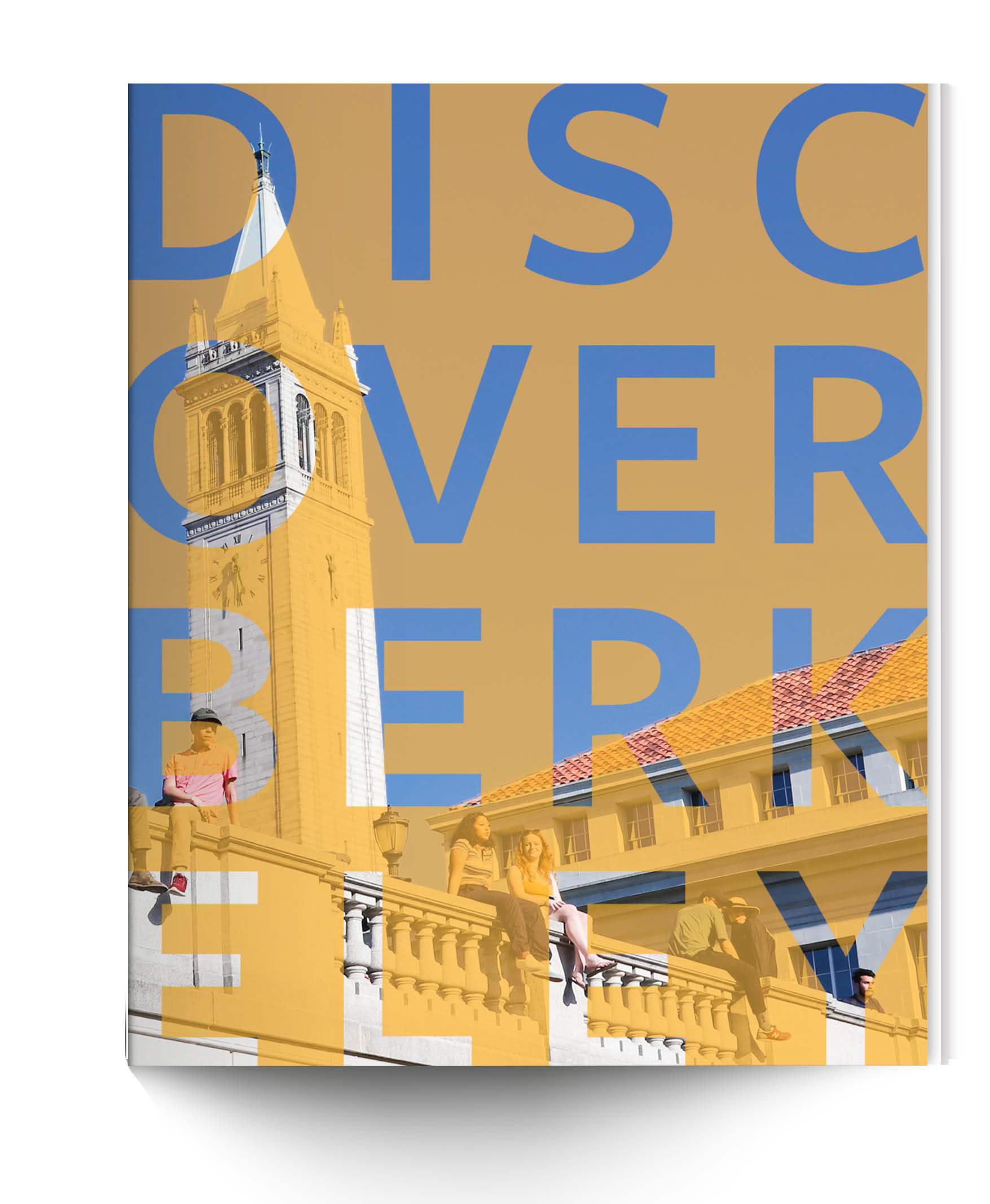
In 2019, the UC Berkeley Admissions Office was getting ready to update its overall messaging and visuals. Student Affairs Communications was leading the update and I was selected as design lead, relying on support and guidance from the Senior Designer. It was a huge learning experience for me. I was included in every step of the process: planning, strategy, photo shoots, and messaging meetings.
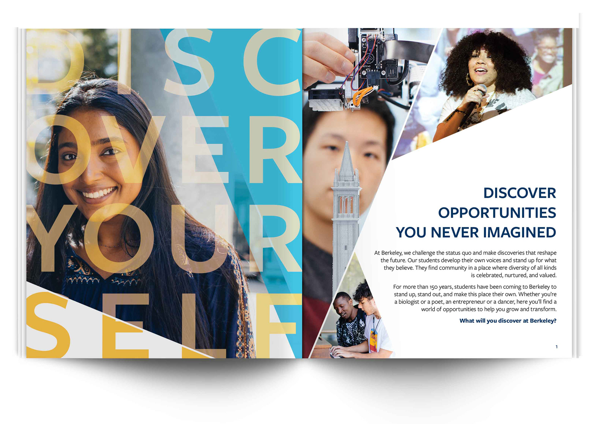
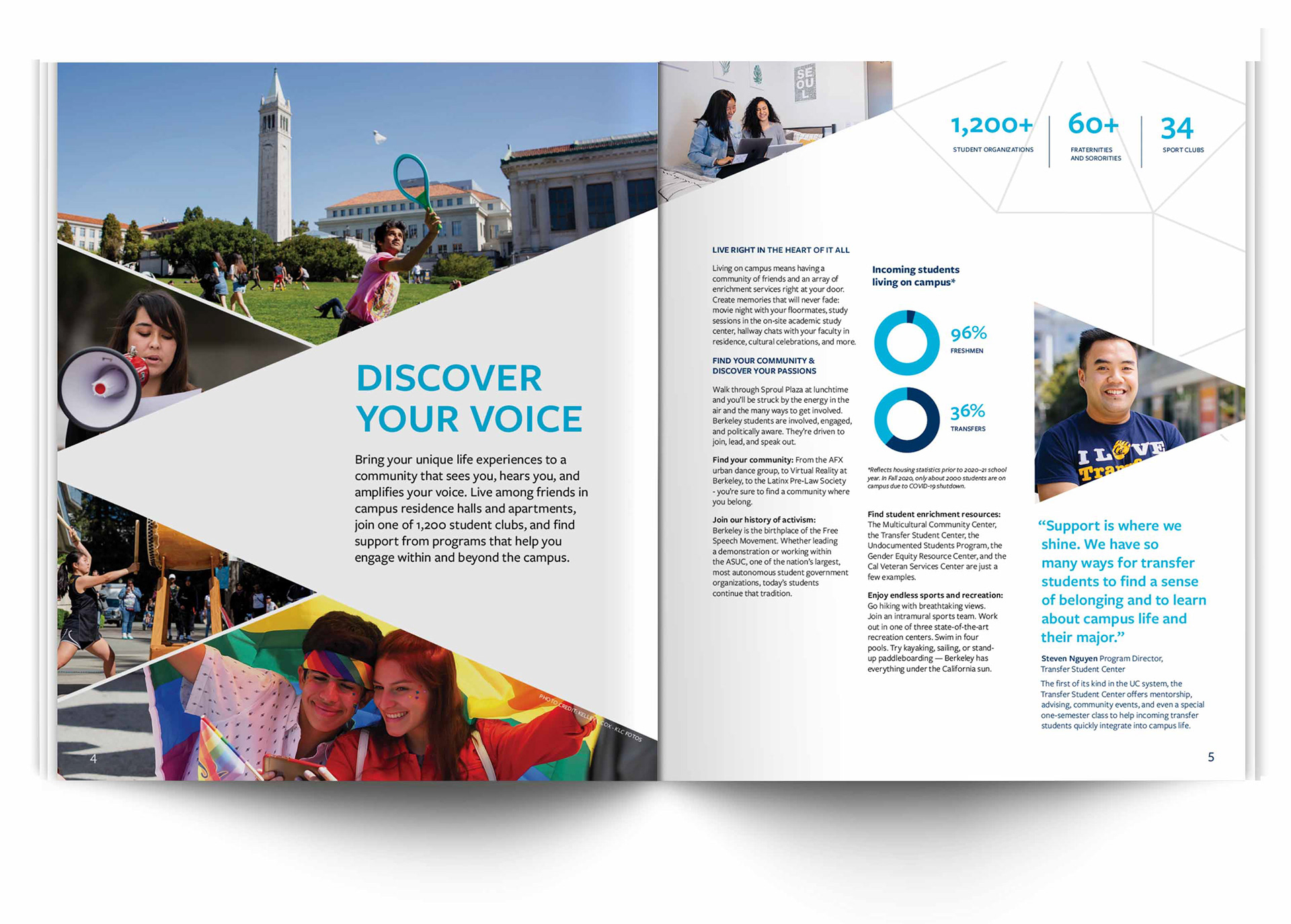
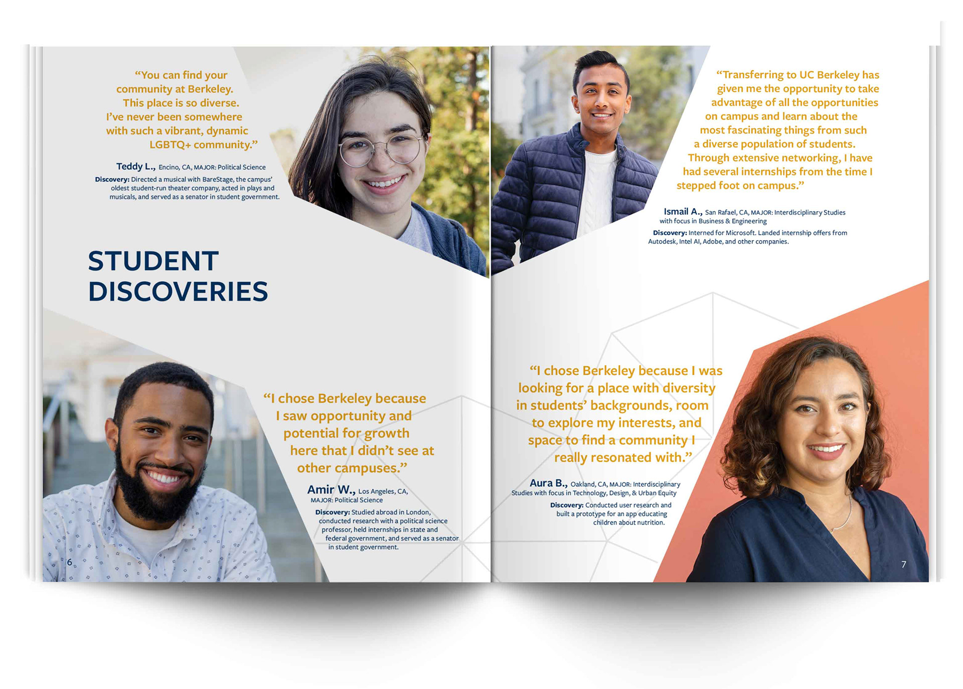
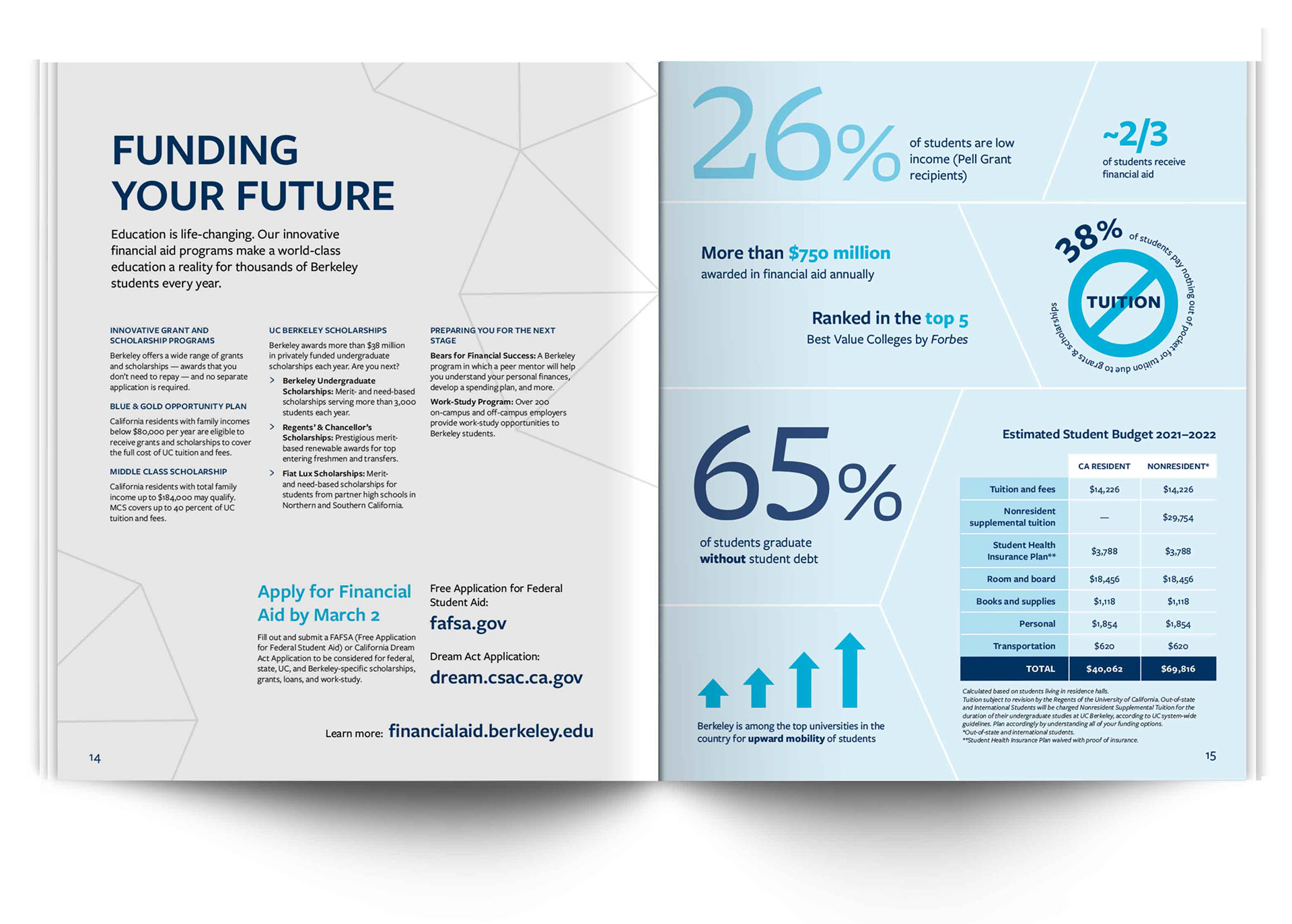
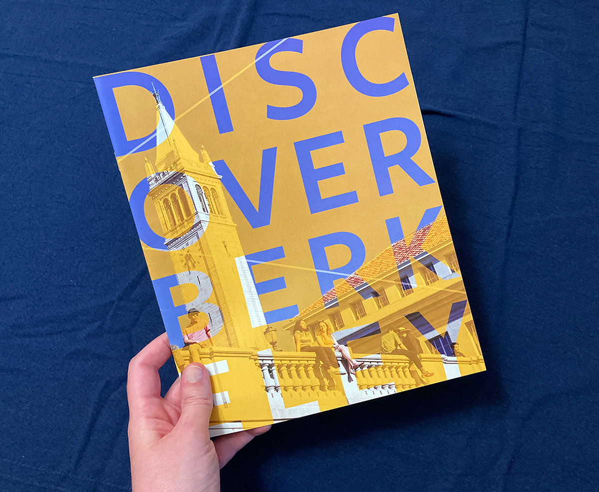
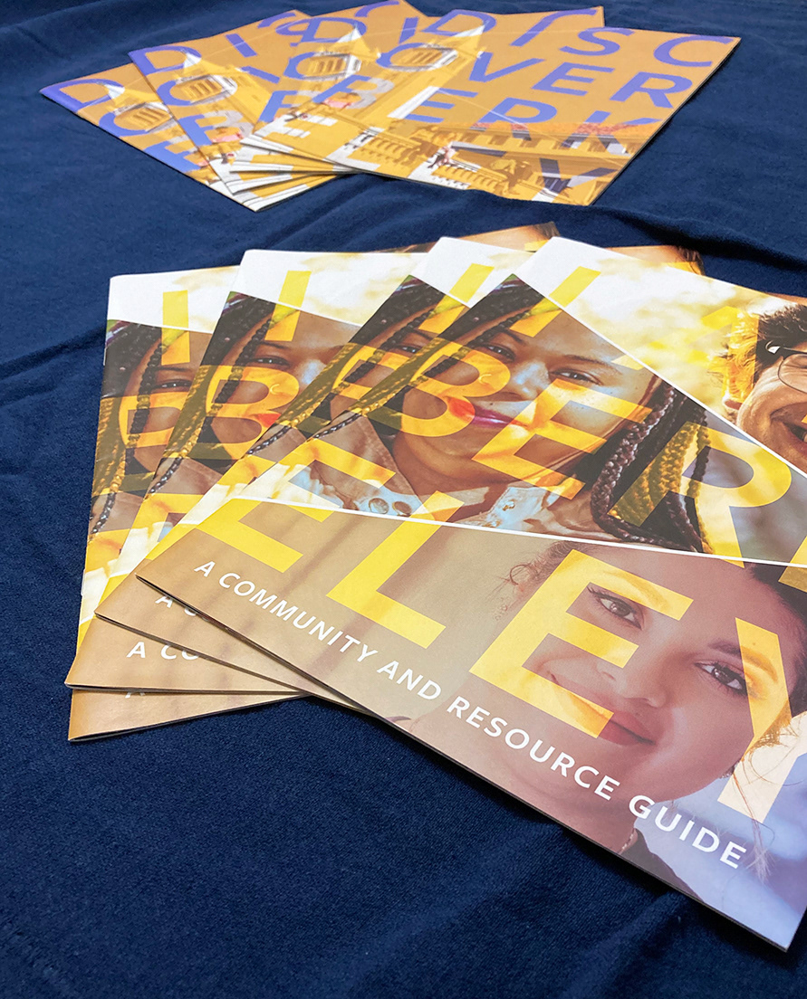
The print publication set for the Admissions Outreach season was the first deliverable of the update. These pieces set the basic messaging and the visual look for all Admissions communications, including email campaigns and social media.
The themes that stood out from the brainstorming and feedback sessions were:
- Light and bright
- Warm and welcoming
- Using lighter brand colors, such as the California Gold
- More photos showing the diverse student experience/life on campus
- Highlighting campus resources
- Showing school spirit
- Light and bright
- Warm and welcoming
- Using lighter brand colors, such as the California Gold
- More photos showing the diverse student experience/life on campus
- Highlighting campus resources
- Showing school spirit
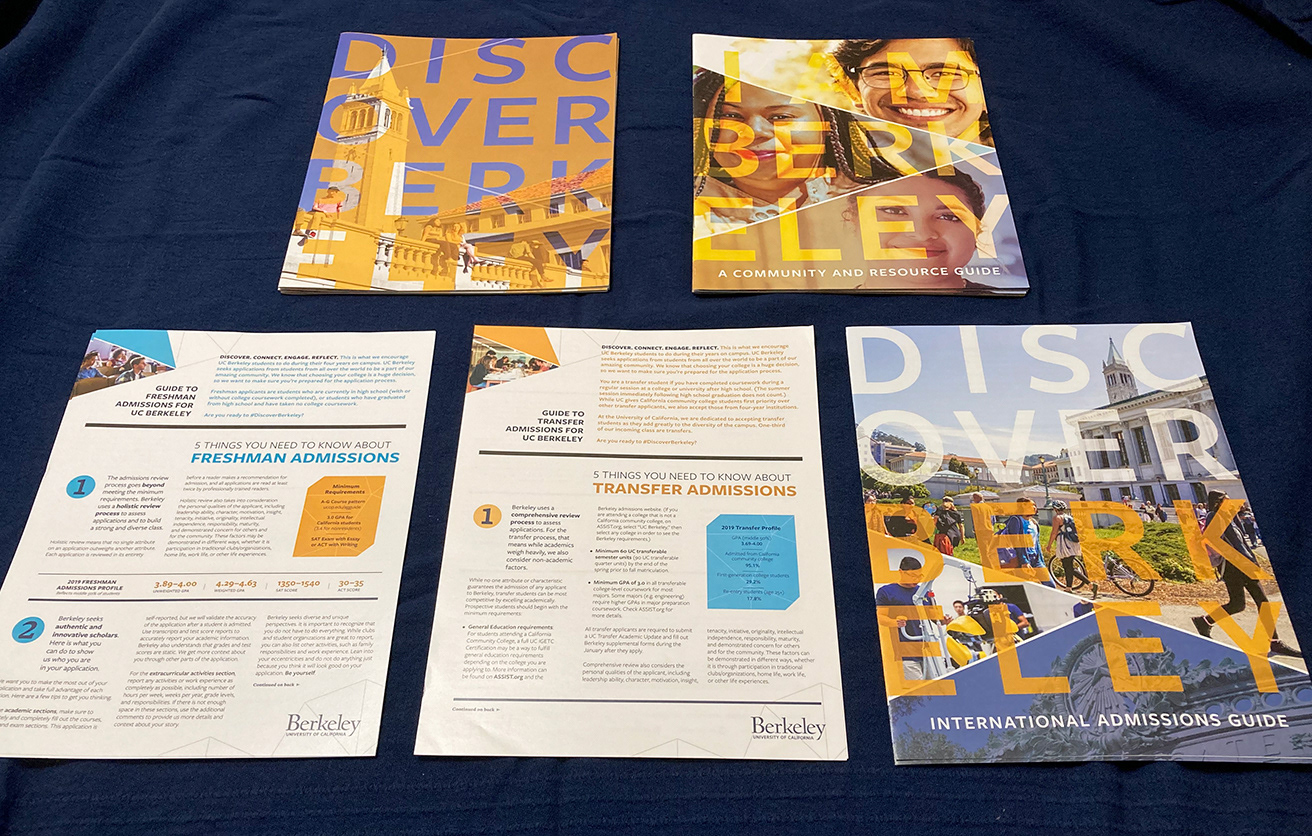
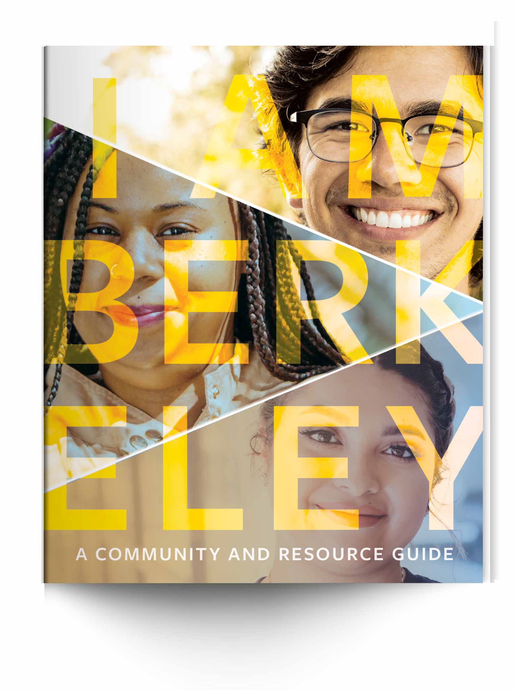
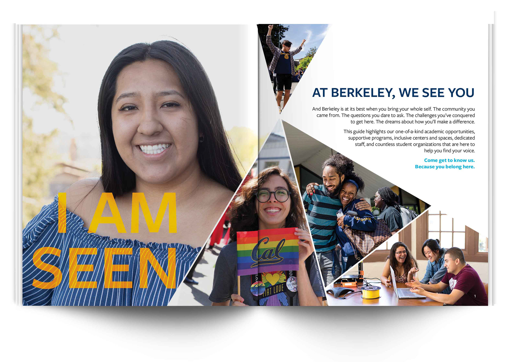
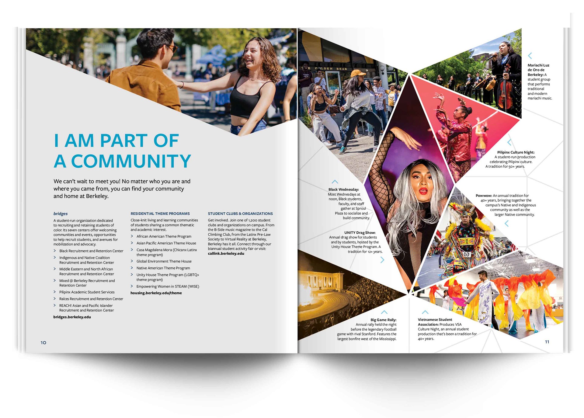
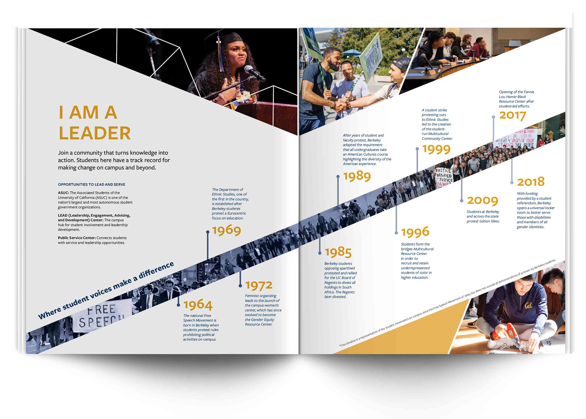
Taking all of this and considering the UC Berkeley Brand Guidelines, I started iterating on the "Discover Berkeley" brochure cover and some sample spreads. I worked with the Senior Designer to smash and break concepts and improve the overall designs. I also worked on the "I Am Berkeley" Community brochure that focused on student resources and “finding a home” on campus.
There were a few additional fliers that were added after the brochures were finished. These provided more for specific information about the application process. The Senior Designer created two of the fliers (one for Freshmen and one for Transfers), while I created the third (for international students).
